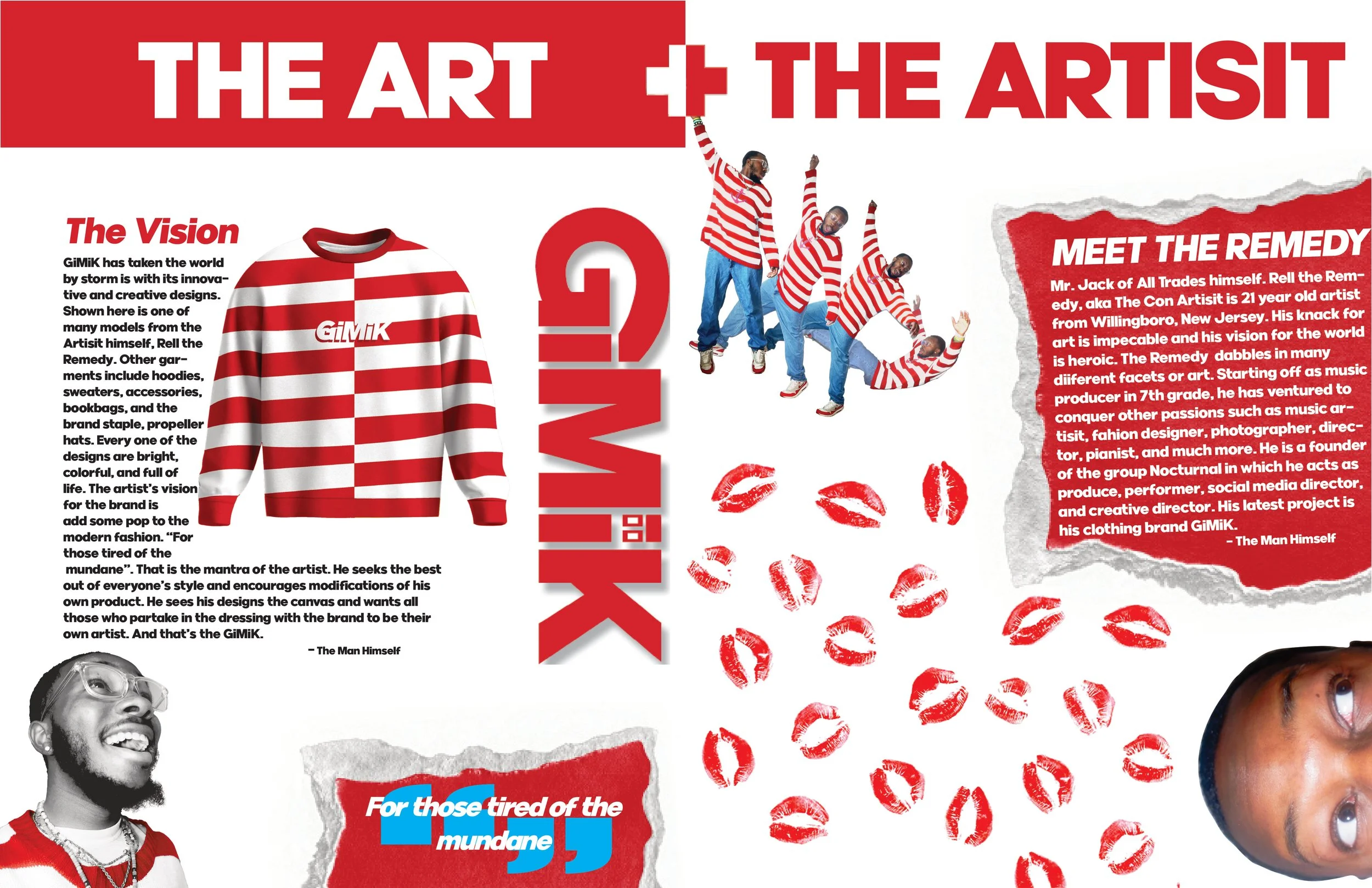
Client wanted a magazine spread for their brand introduction. I used 2 main colors red and white with a splash of blue for consistency through the layout. I also used photos from a photoshoot with the artist to create flow with literal eye direction pointing the reader to the subjects. I used a pull quote to emphasize the brand’s tagline. I made sure the brand is known and from whom it is created by.
Next
Next